Some buildings are so ugly, the only thing that could possibly improve them is a wrecking ball. It’s even worse when the structures are high-profile and expensive, making you wonder how many people who had to sign off at each stage of planning and construction actually thought to themselves, “Yes, this looks good.” Here are 15 examples of astonishingly ugly architecture that only a mother (or rather, the designers responsible) could love.
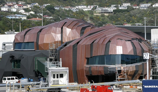
The Rock, Wellington International Airport, New Zealand

Perhaps this addition to the Wellington International Airport by Warren and Mahoney was designed to resemble a robotic cockroach in order to remind us of what will rise up and take our places on earth once we’ve succeeded in making ourselves extinct.
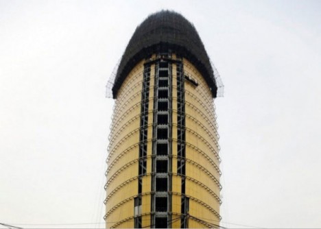
Renmin Ribao Building, Beijing, China

Beijing’s ‘penis building’ aka the headquarters of the communist People’s Daily newspaper has drawn wonder and incredulity from local residents, as well as worldwide notoriety. But the building will soon be sheathed, as the architect decided to give it a makeover after all the backlash. There’s probably a joke about state-sponsored journalism in there somewhere.
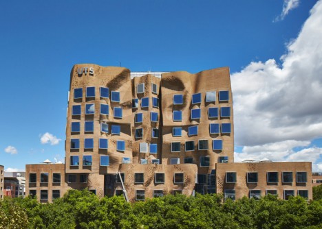
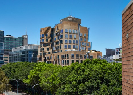
Frank Gehry’s Australian Blunder

“The building so ugly, it has to wear a paper bag” is Frank Gehry’s first project in Australia, inspired by a mashup of Sydney architecture and a treehouse. The curving structure was created using 320,000 custom-designed bricks.
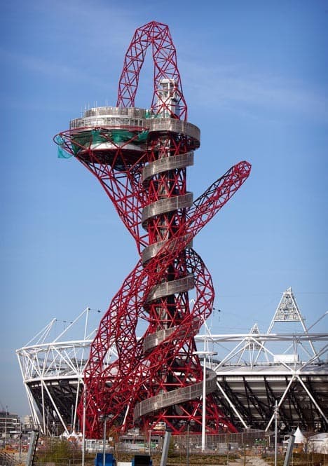
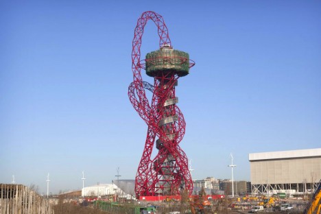
ArcelorMittal Orbit Sculpture, London, England

Famed artist Anish Kapoor teamed up with engineer Cecil Balmond to create a sky-high tower in London that looks like a tangle of junk you pulled out of a drawer in your garage. The ArcelorMittal Orbit is a 376-foot-tall sculptural observation point overlooking the Queen Elizabeth Olympic Park.
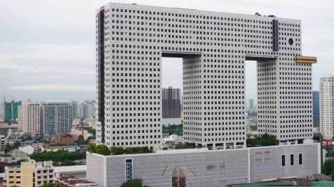
The Elephant Building, Bangkok, Thailand

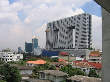
Shaped like Thailand’s national animal, the Elephant Building in Bangkok is a 32-story mixed-use complex housing condos, offices and a language school.
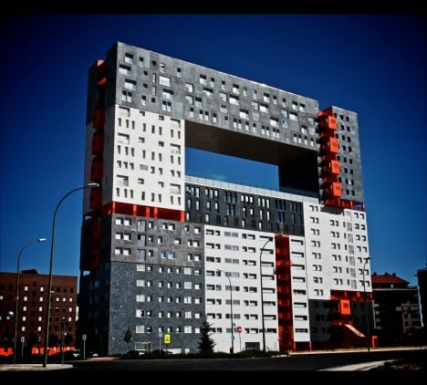
Mirador Building, Madrid, Spain

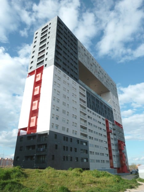
Known for its imaginative innovation, architecture firm MVRDVhas always been divisive, but the Mirador Building is a miss simply because it’s got virtually no aesthetic value. The jumble of window shapes and colors and utter lack of symmetry make this building seem as if it was constructed out of leftover parts from other projects.
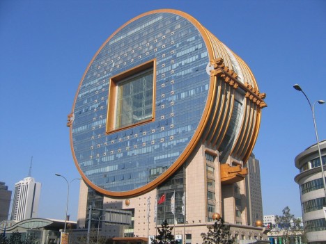
Fang Yuan Building, China

The coin-shaped Fang Yuan Building in Shenyang was meant to be a landmark, and that it is, but mostly because its clunkiness stands out so starkly among the rest of the buildings in the area.
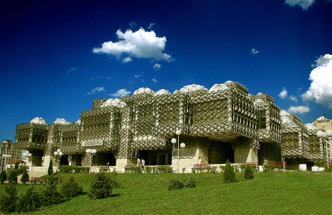
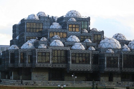
National Library in Pristina, Kosovo

Kosovo’s national library stands as proof that when you put a bunch of attractive elements together into one package, you don’t always get an attractive finished project. The architect blended Byzantine and Islamic architectural forms with a modern sensibility for an overall effect that’s simply weird.
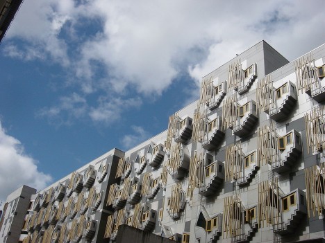
Scottish Parliament Building, Edinburgh, Scotland

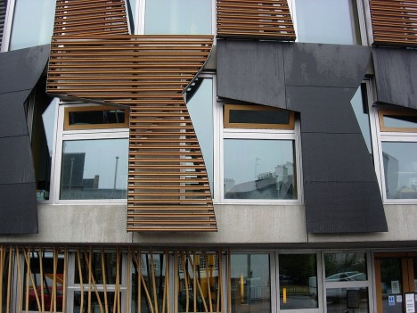
Inspired by an iconic painting by Henry Raeburn called ‘The Skating Minister,’ the distinctive windows on the Scottish Parliament Building in Edinburgh are unique, to say the least, but these unnecessary decorative flourishes are just the tip of the iceberg when it comes to the building’s problems. Since it was built in 2004, Scottish taxpayers have spent over $16 million to maintain and repair it, as pieces keep falling off inside and out.
Sharp Center for Design, Toronto, Canada

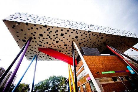
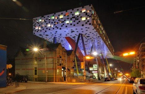
A big white pixelated box rises on colorful pillars to form a canopy among the traditional buildings at the Ontario College of Art and Design. Meant to emphasize the mix of Victorian and modern architectural elements in the area, the contrast is ultimately cartoonish, demonstrating a complete lack of subtlety and nuance.
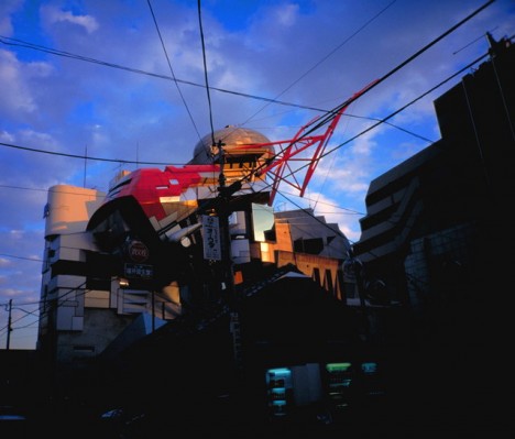
Aoyama Technical College, Shibuya, Japan

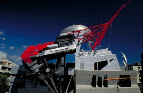
It’s hard to tell what’s even going on here, and that seems to have been architectural firm Makoto’s intention. Echoing the sprawling disorganization of metropolitan Tokyo, this building at Aoyama Technical College is uncomfortably disorderly. Says the architect, “It is not my aim either to transplant to Japan the classic Western patterns of building cities or to put up with the chaos of Tokyo as it is, but to grope for the way we want the new city to be.”
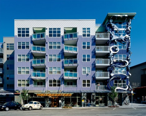
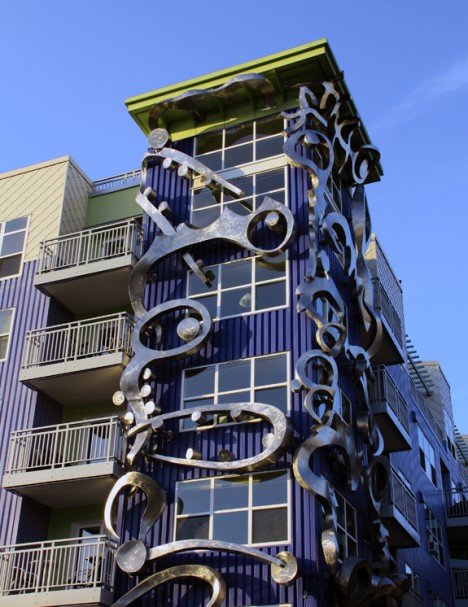
Epi Apartments, Seattle, Washington

What is even happening here? Are those eyes? Mouths? The Epi Apartments in the Fremont district of Seattle are really something. Adding some misshapen metal to a boring building doesn’t make it more beautiful, but hey, here we are talking about it, so perhaps the architects achieved their goal after all.
Pixel Building, Melbourne, Australia

The colorful facade wrapping around the Pixel Building in Melbourne is, in the words of architects studio505, “a system comprising of Living Edge perimeter planters, fixed shading louvers, double glazed window walls and solar panel shading.” It’s meant to be harmonious, but in the end, it’s like wrapping an ugly gift in colorful paper.
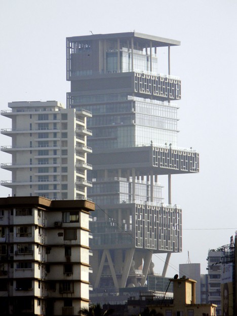
Antilia, Mumbai, India

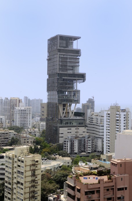
Looking like an oversized vertical shanty town, this disorganized stack of volumes in South Mumbai is actually the world’s most expensive private residence. Antilia is owned by billionaire Mukesh Ambani and has a staff of 600 just to maintain it. Designed by Chicago-based architects Perkisn and Will, the 560-foot-tall structure cost an unbelievable $1 billion to build.
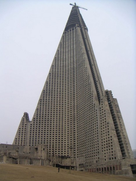
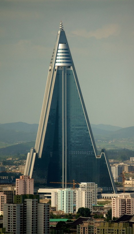
Ryugyong Hotel, Pyongyang, North Korea
Part of the reason the so-called ‘Hotel of Doom’ has been disparaged for its looks for so long is that it sat partially completed and neglected between 1987 and 2008, a villainous concrete peak rising from the capital of North Korea. By the time it was finished in 2011, it was at least fully dressed in its windows and fittings, but it’s still not an attractive structure by any stretch, and it’s still not even open for business.
Source: Ugly Architecture: 15 of the World’s Most Hideous Buildings | Urbanist

